Do you hate it, when you have to constantly switch tabs and windows to reply to a message, add a note, or translate something? Well, you don’t have to anymore, with Vivaldi’s WebPanels!
Basically, you can add any website’s icon in the Vivaldi’s sidebar, and clicking it will pop-up a narrow panel with the chosen website, alongside the one you are currently browsing. Of course, not all webpages fit into such narrow space — Vivaldi tries to load the mobile version, which sometimes helps.
In this post, I’ll introduce you to my favorite WebPanels!
Some hacks first
You can add WebPanels simply by navigating to that page and clicking the “+” button in the Vivaldi sidepanel.
If the added WebPanel doesn’t look good for whatever reason, you can try switching it to the PC version by right clicking and selecting the option.
Also, some webpages aren’t pretty when squashed into a WebPanel. These problems can be usually solved by writing a custom short piece of CSS. Don’t worry, I have shared the pieces I use. To modify webpages’ CSS, you’ll need the Stylish addon installed.
Puf’s WebPanels
Facebook Messenger
 You probably know of Messenger.com, the Facebook Messenger’s web version. This version can be fit into a WebPanel, but some dirty tricks have to be used.
First, Facebook blocks Messenger web version on mobile: you have to switch to the PC version.
Also, you’ll need my little script to make Messenger narrower. Open Stylish, click three dots, select “Manage All Styles”. Then create a new style, name it whatever you like, paste the gist content in there and set it to execute on domain messenger.com. Now your own narrow Messenger is ready!
 Apart from Messenger, you can have Facebook in the WebPanels, too. Just remember to use the mobile version: m.facebook.com
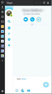
Skype
 Skype has a web version, too. This time, you don’t have to switch to the mobile version, but there is a style you may prefer to install, to remove some clutter (like the large footer). Set it to run on domain web.skype.com.
Google Keep
 Keep is the Google’s app for taking quick notes. It’s amazingly simple and practical — I highly recommend it. And the best news: it works in the WebPanel out-of-the-box, no CSS fiddling needed!
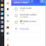
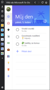
Microsoft To-Do
 To-Do is a little known app by Microsoft, aimed to be the replacement of Wunderlist. It is very simple, but efficient.
However, it doesn’t look good in the WebPanel at all. Style for the rescue! Set it to run on domain todo.microsoft.com.
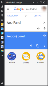
Google Translate
 Google Translate has a mobile web version that works out-of-the-box as a WebPanel. Now you are able to instantly translate any words you don’t know, when reading in a foreign language!
Honorable mentions
There are many more pages that work in WebPanels: Google Drive, Telegram, Twitter (mobile version), GMail and so on. Don’t be afraid to experiment!
Last words
I hope you have enjoyed this post and/or found it helpful! What WebPanels do you use?